Choosing the right paint for your home or commercial property can be a daunting task. Especially when you are presented with diverse colour options and even more challenging different shades of it. Determining which one is the most suitable for paint becomes very difficult.
That is why we have created some essential practical tips that can help you figure out how to choose the paint colour and where to apply them.
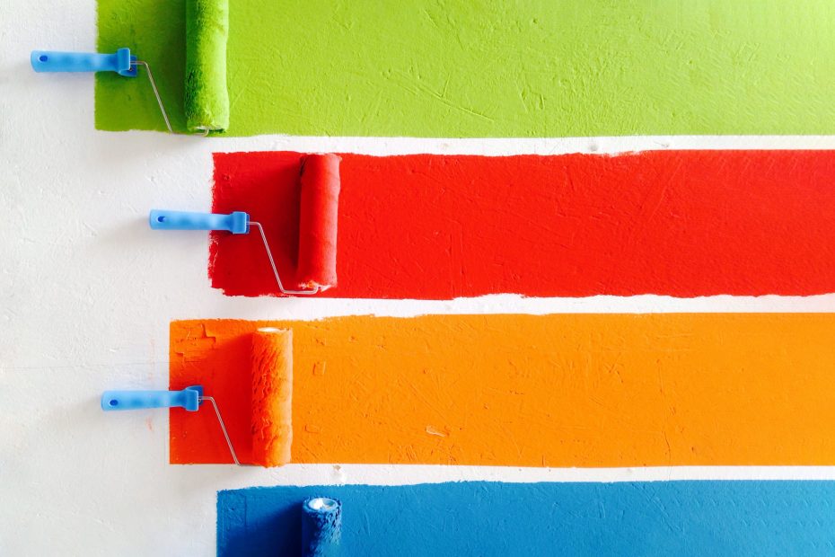
Remember, It all starts with knowing your Basics.
Literally so many colours to choose from, you can never run out of options. It is always the case when looking out for that specific shade you want in your home.
A practical tip that can help you is knowing your basic colours on the paint spectrum: Red, Orange, Yellow, Green, Blue, Indigo and Violet.
Now eliminate colours you don’t prefer and keep colours you want to explore more.
In this way, you have eliminated numerous choices that might’ve wasted a lot of your time and narrowed it down to only the colours you want to see more of.
Experiment more with Whites and Greys:
House Painting is all about experimenting, but just sticking with the basics can be enough to attain your aesthetic goals. Whites and Greys are two important colours that can seem silently luxurious, royal and lavish if you can nail the aspect of choosing the right shade.
White:

Know your whites.
Whites are beautiful. And it can go pretty well when paired with bold colours. But it is essential to choose it’s right palette.
You can find clues from observing your surroundings. Look for the lighting, corners and space in your room. If your room has a darker tone than appropriate shades of white can balance it out and make it more luminary. If it follows a lighter tone, bright undertones of white can make it feel cooler and soothing.
Brighter tones are more lavish and screams silently royal. Perfect for your modern or minimal aesthetic house as they will enhance it with its cooler shades with slight grey undertones.
Lighter tones have a hint of pinky or peachy undertones that perfectly complements your countryish or cosy house vibes. You can play around it a lot to find which can be more suitable.
Grey:

Grey Shades are usually of soft, relaxing and neutral palette.
Light and Warm greys are best for bringing tranquillity in the room. They are also a great replacement for whites. Balances the bright yet dark theme beautifully.
Cool and Dark greys bring a clean, crisp and bold statement to your room. They can be influential to your feature wall, instantly catching your eye- catching.
Whites and Greys are also highly recommended for Commercial painting as it brings a clean, sophisticated and opulent vibe to your working environment.
Ceiling is your 5th Wall, Floor is in the mix.
What do we mean by this? Ceiling can be as influential as your four walls, proper treatment of your ceiling can equally turn heads as others. The same goes for the floor, it might get neglected but it is always in the mix. If harmonised properly with the walls, it can uplift the looks of your room.
Ceiling:
Ceiling paint’s job is to make the room seem more heightened. This can be achieved through shades of white or other lighter shades of colour closer to it.
Not only for the illusion but also to make the room seem more spacious and big. It also helps achieve that cosy vibe if it is paired with warmer shades of the walls.
Floor:
There ain’t much scope to explore when it comes to the floor painting however, it can go pretty well if the shade lands accurately to match the vibe of the room.
Light Hardwood floors can blend with white, grey and other neutral colour shades that can work pretty well in giving that luminous, grace and breezy feeling in the room. It also works better to harmonise walls to it.
Dark Hardwood floors blending with brighter shades of brown, beige, or earthy tones can make your room space achieve that warmer undertone. It is better suitable with larger room dimensions as it unifies with the room space.
Generally, proper tile or carpets for example greenish carpet works well with the blue or white tone of the room and many such more are also an option you can consider to make your floor stand out.
Lighting is your ally.
Everyone loves good lighting. More so as it is a competent factor in deciding which colour to choose while house painting.
E.g If you paint your room with lighter hues, it will seem more luminary. If you paint it with darker hues, it will not reflect much light making your room seem dark and gloomy.
Here some colour selection tips with which you can work well with lighting:
✅ Remember, to always choose the shade of the colour for your room when house painting in daylight.
✅ Get a sample of small squares of primed drywall and paint it according to tints you are considering and compare them with your room wall in sunlight.
✅ Paint finishes are significant in affecting colour. Glossy finishes will reflect light while flat finishes will reflect less. One will change the way colour looks and the other will bring its true hue in brighter lights.
✅ South Facing Dark Rooms will work great with Brighter Tints, do take this in mind while getting a shade.
Conclusion:
Right Painting Job can be highly satisfactory if you can get successful in choosing the correct tonal hue for your home. Otherwise, it is also helpful to get an expert’s opinion on this.
For Expert Painters Sydney Services, ASL Painting will provide expert guidance and complete interior or exterior painting solutions for your household or commercial property.
Our skilled and professional painters are ready to showcase their craftsmanship, Reach out to us Today!