Your Creative work area as in your Private Studio or Your Office workspace is where most of your productivity hours are spent. It is a place where you build business relationships and grow your bag! In all your workspace gives away a lot about who you are, a reflection of your personality.
A right commercial painting job can completely elevate your space and effectively make it more professional.
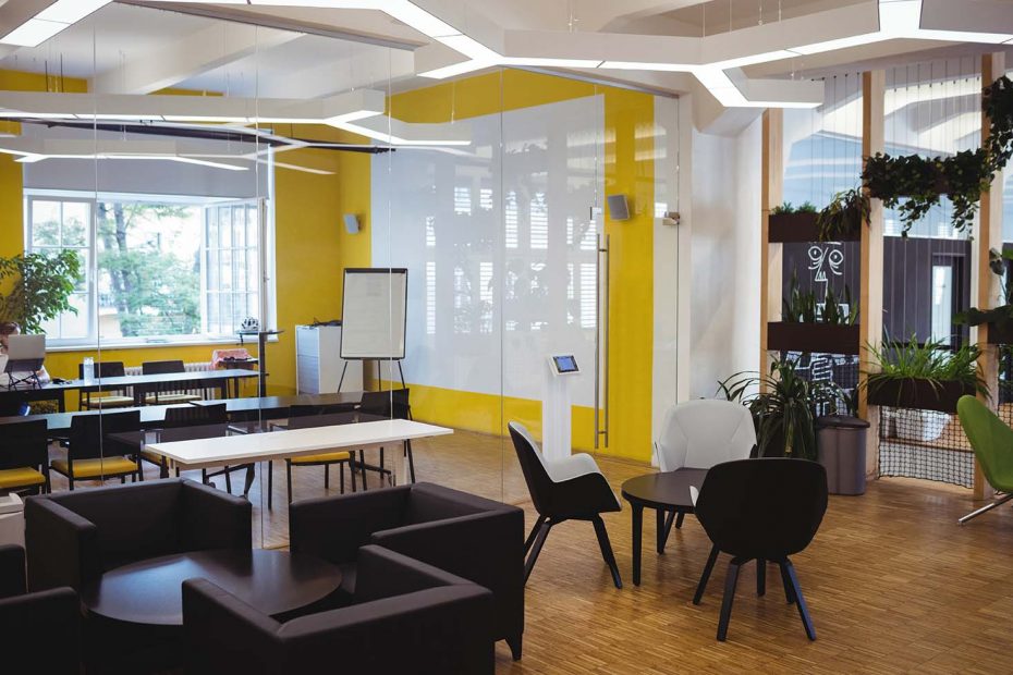
You want your creative space to be inspiring and motivating, you can add a ton of personality to it even when working with basic palettes of colours.
Remember, Your office should not be more distracting so that you can focus on what it matters. Going all rainbowy is not a viable option hence, choosing the palette wisely is essential.
Here are some tips to help you choose the right colours when commercial painting for your office.
Neutral Colours.
Afraid to experiment? Your Classic Neutral colours are here for the rescue.
Neutral colours are not intrinsic visually, but the right combinations can elevate the space completely and brings the charm of the room out pretty easily.
They can also blend well with dynamic, artistic and vivid shades of brighter colours. A chef’s kiss when blended with dark shades. Simple lighter shades of whites can blend and look exceptional with silent dark colours such as black,blue and white.
If you are a Creative, then it’s essential that your workspace looks abstract. Blend in combinations of neutral shades with vibrant and bright colour palettes.
Solids > Patterns.
More Choices results in more distractions and you don’t want it more in the norms of your office.
Patterns, though tempting, can be visually distracting. Choosing the patterns can also be time consuming as you might want to commit that to your ongoing projects. If you intend to go creative, blend solids and play with the outcomes. This way, it is less distracting and allows you to make your decision faster. In a way, the outcome looks cool and fits your aesthetic.
Walls are the Main Character.
Commercial Painters Sydney wide’s work stands different as you want to make the colorwork look cool and aesthetic yet you don’t have much to work with. – After all, it’s your workspace and you want as little distractions as possible.
However, this is where your main character stands out – Walls.
An important question before a paint job that comes to every working professional’s mind is – How will you use the walls in your office space?
This is where finding Wall functionality becomes important. If your wall will generally cater to different ornamental items such as posters, bookshelves, your achievement trophies, etc. then you need to highlight them more and not your wall – so you need to opt for lighter shades of solids.
If your wall will generally remain empty or with less items, then this is where you can use the colour to add some personality to it.
Now this doesn’t mean you can roll your paint to go all carbonado on it. Your colours should be calm, silent and be visually pleasing. It’s all about finding the balance.
So what are the silhouettes and palettes you can work with? Here are some of our preferred hot choices –
Recommendations.
Grey – Admit it, Greys are beautiful and visually pleasing. It appears cold and melancholy hence, you need to balance it with appropriate shades of it.
White/Beige – The clean, soft and neutral appearance of off whites and beige is the perfect choice for your workspace. It is visually soothing, less distracting and silently royal.
Teal – Light blue or Teal is increasingly getting popular amongst modern offices for its striking balance between being vibrant yet light. It is calm and relaxing especially during high pressure and long tasks, soothing to the eyes!
Green – Again, a vibrant option that can be extremely versatile due to its variety of shades. Its deep shade gives vibes of richness and luxurious – perfect for offices of a financial advisor or a lawyer. Lighter shades are serene and calming – preferable for offices of a doctor, dentist or a studio of a designer.
Other recommended colours can be lighter shades of brown, purple and yellow. Proper tints blending with effective lighting can be aesthetic and elevates the elegant look of your professional creative space.
Conclusion.
Work with your tint options and choose the right shade that can elevate your working space and relieve your time spent there so that you can be productive.
For professional Painters Sydney wide, Our ASL’s colour experts are here to guide you and provide an excellent service ranging from painting houses to buildings and offices.
We Do It All. – Contact Us today for our professional service at an unbeatable price!